
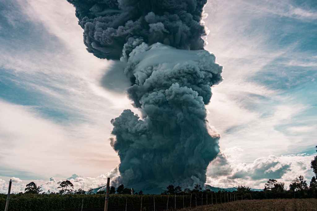
It’s COP time again; they come around so quickly these days, don’t they? In sunny Dubai, the Great and the Good, the Panjandrums of Climate Change, as well as quite a few of the people who got us into this mess, are gathering once again. “This time we’re really going to to something!” they proclaim. Or go the way of a certain well-known group of scaley reptiles, one of whose images is displayed at the head of this post, we surmise.
Out on the fringes, and in certain quarters of the Right-wing press, will be a number of opinionators who will be trying to undermine the whole thing. They and their so-called “experts” never seem do any original research, mind you. But they dig and snipe in the desperate hope of preserving their dirty failing old world, and presumably the memory of a time when they were moderately sexually attractive. (good heavens-which one was it?-ed)
If you want to counter this, a fantastic team of Guardian writers (Damien Carrington, Anna Leach, Paul Scruton and Harvey Symons) has put together a series of quick, easy-to-reference graphs which show the true urgency of the crisis. Here, in terms so simple even a Sun reader could understand them, are all the facts. Rising C02 and methane, forest destruction and the creeping flood which will make Noah‘s little matter look like a puddle in the park. One tiny quibble: nothing references the changing C12/C13 ratio level which for us was the clinching piece of evidence that the whole thing is human-made.[2] But that is to quibble. Marvellous work, and we urge every last one of you, gentle readers, to gaze upon it. Assiduously.
#global warming #climate change #cop 28
